Media Queries
Media queries are used to define which CSS document to follow at certain screen sizes. This allows the browser to deliver different styles to different devices with different sizes. There are two ways to add media queries to a webpage: through Dreamweaver, or through the code itself.
http://www.w3schools.com/cssref/css3_pr_mediaquery.asp
https://developer.mozilla.org/en-US/docs/Web/Guide/CSS/Media_queries
Dreamweaver
How to add media queries through Adobe Dreamweaver (version 12.0):- See how to set up new site/page
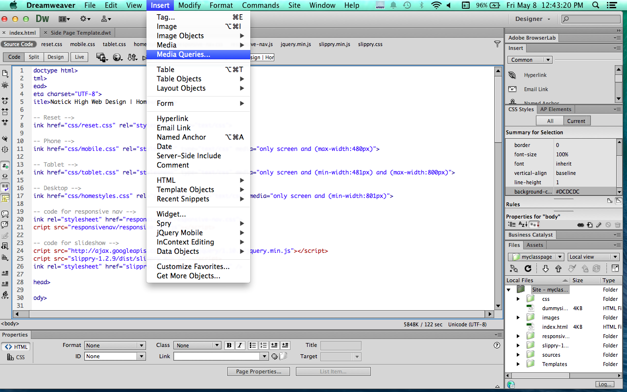
- Once your new site/page is set up go to the index.html
- Insert → Media Queries
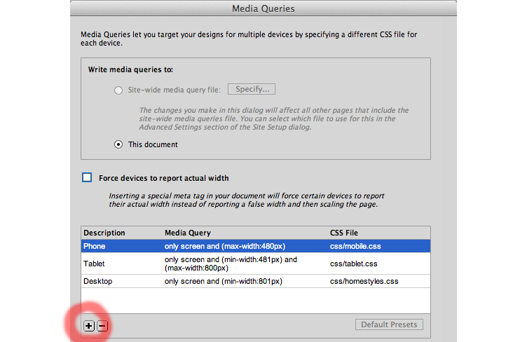
- Press the + button to add a new media query
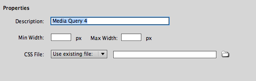
- Give the new media query a name/description
- Give the parameters for the screen’s min and max width
- Link the media query to the correct CSS style sheet
- Repeat for the amount of different media queries
Code
How to add media queries through code:- See how to set up new site/page
- Once your new site/page is set up go to the index.html
- Use the code to link external CSS style sheets: < link href="css/tablet.css" rel="stylesheet" type="text/css" media="only screen and (min-width:401px) and (max-width:800px)" >
- Edit the min and max widths
- Link to each style sheet by repeating steps for different screen sizes
For more information
See these websties:http://www.w3schools.com/cssref/css3_pr_mediaquery.asp
https://developer.mozilla.org/en-US/docs/Web/Guide/CSS/Media_queries